Evaluation

Mest 2 evaluation


I have chosen to complete brief three, I worked individually to create a low-budget marketing campaign for a small, upcoming band signed to a small record label, I chose to create my work on the platforms, print and broadcasting. I have created four A4 posters, two advertising the tour, one advertising the album and a further one advertising the tour, album and the band themselves.  For my broadcast task I have created a short video containing a sample of the bands music, footage of them playing and an interview with the band, the video is intended to help an audience get to know the band and it also informs people of tour and album information as well as providing links to their social media.

My research into other print based media texts, created for bands of similar genre and style to my chosen band revealed a multitude of things and I built my posters around the conventions that I had observed. For example my tour poster follows a very conventional layout, with the bands name and the tour name at the top in large print, with a list of dates and venues around the lower middle of the poster and then towards the bottom social media information and ticket information. I noticed that most posters include the bands name in the form of their logo, so, with that in mind I have done the same, replacing the bands name with their text-based logo, so that it is still legible but also showcases the bands style. I also noticed that a lot of 
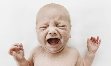
conventional posters include an image of the band, but I was unable to get a high quality image of the band, so I improvised, creating a ‘mascot’ in Photoshop, using an image of a baby crying and a male body builder as material. I then used the photo of the ‘mascot’ as the main image of the poster. All of my posters contain fairly simplistic backgrounds as I found that this was conventional, and it made the poster more legible by not distracting the viewer with un-important content. My posters also contain highly contrasting colours, and a colour scheme comprising of mainly black, white and grey, as I found this was conventional for posters of similar genre to my own chosen genre and it also made the posters easy to read and striking.

My research into similar broadcast based media texts for similar bands to mine helped show me which direction I should take my piece in when I was filming and creating it, I found that, conventionally, band biographical style videos contain footage of the band in a variety of situations, including, performing, messing around backstage and in the studio. I recognised that most of these videos also include ‘plugs’ for social media outlets of the bands and that the bands also use the ‘interview’ sections of these videos as ‘free airtime’ to promote themselves, often taking the chance to talk about their tours and upcoming albums or singles. With this in mind I created my broadcast piece to mimic the other videos I had watched. During filming I let the band themselves take the lead, the only parts that I had influenced, was I told the the name of the tour, and I told them the locations which the band would be playing, the rest was unscripted and organic, which I felt helped my video feel like one of the conventional videos from other bands. The footage I ended up using for the video included footage of the band playing and the unscripted interview with the band. I also included a large amount of anchorage at the end of the video, heavily focused on social media and the bands upcoming album, as I found was conventional. The entire video is set to one of the bands musical pieces, which is lowered in volume during periods where there is other things going on, such as during the interview, this eliminates dead air and allows the audience to be exposed to some of the bands music, I found this to also be conventional within the genre.

My finished pieces were really strong in some areas, for example I believe that my posters are visually striking and that they are effective in informing and generating interest in my target audience. My posters are also iconic in styling and they are consistent in information and styling across the board, my posters also share some stylistic qualities with my broadcast piece, giving all of my work the same sort of feel and making it feel more professional. My posters are all in high resolution and I have taken care to ensure that they have as few rough edges as possible and that they are as polished and professional as I can make them. My broadcast piece has a few very strong points, including its licensed studio quality sound track and its obvious and informative transitions. I believe the footage I recorded for the video was of good quality and is thematically matching and is conventional in its nature.

However, my finished pieces also have some flaws, I was unable to get a high quality image of the band for one of my poster designs so instead, I created a mascot from found images on the internet which I edited into one image, whilst the mascot serves its purpose and is eye catching and powerful, it doesn’t quite fit my original vision and doesn’t represent the band members. My broadcast piece also has a few issues, it didn’t quite turn out how I wanted, partly due to the organic nature of the interview, where I allowed the band members to reply however they wanted and let them lead the way during the interview, I believe that, while this created an authentic feeling to the video, it could have been made more professional and still made to feel authentic with a good script. Another issue with my broadcast is that my backing video doesn’t quite match the soundtrack, but without complex compression of time I couldn’t edit the video to make it fit perfectly. I would have done this if I had had more time to edit the video, but my final version of the video was edited under severe time constraints after an earlier cut of the video failed to render properly and was un-usable.
I believe that, I focused too much on the construction of my content from a stylistic point of view and I have failed to represent the band and record well in some areas, I believe this could be rectified with more use of the bands branding and the record labels branding and a heavier use of the bands image, including actual photos of the band. I do however think I created content that matched the theme and genre of the band and that lines up with the conventions seen in other similar pieces for other similar bands of similar fan base, genre and theme.

For my third platform, I would have created a three page website for the band I am promoting, the website would have been integrated with the social media of the band, with links to their facebook, and myspace presence. The website would have a home page, with navigation links to the other pages, links to their facebook and myspace, and a widget that contains their latest facebook posts. The home page would also include a header containing an image of the band members, their name/logo and a small ad for their debut album the home page would also feature some general band related news. The website would also contain a page focused on the tour, with information on each venue and date and a link to purchase tickets, the tour page would also include navigation links and the header from the home page. The website would also contain a page dedicated to the album and its purchase, this page would also contain the header and navigation links previously mentioned, with links to all the different ways to purchase the album, including, iTunes and the nutune records record store, which ships physical copies of records, in vinyl and CD format.


Poster Planning

My posters are going to be designed to be very eye catching, whilst still in the white on black or black on white color schemes. To do this, im going to make use of the fact that the colors im using are very contrasting and im going to vary text size to make the text more engaging, with important things in larger text, such as the bands name and the tour name, my posters will all contain direct references to either nutune or the bands social media presence to reinforce the bands social presence and encourage fans to engage with the band. I intend to include some kind of eye catching photo in one of my posters to draw attention to it, either some form of mascot or a photo of the band. My posters will be informational in design also, including tour dates, venue information, ticket information and social media information.

Broadcast Planning

Using what I found out from my research I have decided that I am going to structure my video in a conventional manner, by having an intro section, a question section and then an outro section. the intro section will contain footage of the band playing and some sort of introductory anchorage, mentioning nutune records and the band, the question section will have transitions with anchorage containing questions followed by a clip of the band answering the posed question. The outro section will be a series of title cards over footage of the band playing with links to social media and outlets for tour tickets and the album. I will record footage of the bands interview in an actual studio at college so it feels more professional and i will record footage of them playing in the actual studio. I will back the whole thing with music provided by the band.

Evidence Of Creation

All print work was created in paint.net using text tools, geometry tools, gradient tools and plugins to create noise and distort an image. Filters were applied to some images to change the color of them, these filters include black and white filters, saturation filters and contrast filters. The only part of my print work NOT generated within the editing software is the mascot on my fourth poster, which was created by combining two images in paint.net sourced here and here. Text was a combination of three fonts, Cambria Math, Symbol and DIN schablonierschrift. Backgrounds on my first two posters were created by generating patterns of noise, warping them using a distortion plugin and then twisting them into a circle using a twist distortion plugin. The background of my third poster was created by using the black background of my previous poster and running it through a plugin to change areas of similar color into irregular, sharp blocks of a median color. The black background behind the text on the third poster was generated using a series of black rectangles and a plugin to create a 'jittery' effect. My broadcast work was filmed and edited by me, with anchorage and distortion of the background video done using Sony Vegas Pro 11, the background video has a black and white filter and film grain filter added to it, and the anchorage is created using the text media plugin and the DIN schablonierschrift font. Backing music is provided, under license by A Dying Reign, a local 4 piece metal-core band from tees-side.

Treatments

Brief 3
Broadcasting and Print

What do you intend to produce?
A video containing band biographical information and information about their upcoming tour, in an advertisement format. A full page spread advert and a selection of posters.
Intentions based on research
Genre: Metal
Sub-genre: Metalcore

Generic conventions
Costume, style of musical composition

Audience and how they will be targeted

My audience will be primarily teens and young adults, between the ages of 14-30, my target audience is also mainly male in composition. Therefore I will tailor my advertisement accordingly, focusing on appealing to the main age range the band appeals to and focusing on the male demographic. I will do this by emulating the styles of other bands that are similar in genre and demographics.

Institution
The band, its members and the record label will be the institutions represented in my pieces.

Influences
Other bands that are similar in genre have influenced the band

Title screens/typography/layout/navigation/interactivity generic conventions
Title cards to introduce different sections of the video.

Characters

The members of the band

Settings/Locations
Gigs, the bands studio and someplace the band hangs out
Props/Costumes/Mise-en-scene
The bands instruments will be included as props, the costumes will be typical clothing wore by members of the band during gigs.


Image/Lighting
Footage of band performing, stills of band performing, title cards

Use of sound

Audio from interview footage, music provided by the band

Editing and Effects
I will edit the video footage I have recorded and place anchorage in sections of the video

Poster Research

During my research into conventional posters for bands of similar genre, I noticed multiple conventions which I will try and use in my own designs to achieve a professional effect and to fit the style of the genre as best as I can. Firstly, I noticed many posters have a simple colour scheme, usually with three colours, often, one of them being black or white, sometimes both, many posters use a whit on black colour scheme. I also discovered that many posters use highly contrasting text as both a stylistic choice and as a functional choice, as it looks good and makes the text easy to read. Depending on the style and purpose of the poster, I’ve found that, they conventionally contain either, a central image of the band, a list of tour dates and venues or other important information, focused around the centre, with the top of the poster reserved for the bands name and the tour name. I’ve also found that instead of text the posters  often use the bands logo or the tour logo to replace the band’s name or tour name, assuming that the band or tour has a text based logo. I have also found conventionally the backgrounds of the posters are either, dark, or light depending on colour scheme, and contain little in the way of detail so as not to distract from the information in the foreground.

Interview Research

During my interview research I found out various things that I have decided I will use when creating my own interview style biographical video about my subject band. I found that in many interviews, the band is either given a chance to promote themselves or they take the chance to promote themselves within the structure of the interview, for example, they will work self-promotion into their reply to a question, replying to a question such as ‘what do you want to do in the future?’ with a response such as ‘we ideally want to bring out new content to our fans, such as our new album!’ this self-promotion is conventional and therefore I feel it will fit in my broadcast piece nicely. I also found that the band is often asked about upcoming events, such as tours and albums, which also falls under self-promotion, but is less forward in its appearance. I believe this will also fit well into my video, so I will try and include it. Another convention I noticed is that they are often asked about their hometowns, their opinion on the local music scene or some other localised question, so I will also try and work this into my interview.

Band Image Research

I created a collage of bands similar in genre to my subject band, during my research into bands images. Common in these promotional images of the band is the bands logo somewhere in the image and the photos of the band are generally an eye level midshot, so I will try and include this in my promotional material. The mise-en-scene of the images is all very similar and distinct, the artists wear clothing representative of their musical style and character and the location the images are set in is conventionally poorly light and none-descript in nature, the lighting is generally focused upon the band members with the background having very little lighting in most cases.

Print Media Pieces